Virtual Fintech Fair
Upgrade and responsive design for a FinTech company.
CLIENT
Virtual Fintech Fair
ROLE
Team Lead
Pain Points
Personas
Userflow
Wireframes
Prototyping
TEAM
Terena
Derek
Hazel
Niall
Lovina
TIME
2 weeks
Design Brief
The Virtual Fintech Fair (VFF) is jointly organized by FinStep Asia Limited and Novsphere Media Limited. They organize a virtual FinTech event that enables participants to showcase their products and network with investors, industry experts, and institutions.
Virtual Fintech Fair wants to:
Enhance the website's layout.
Looks dynamic and engaging user experience.
Persona
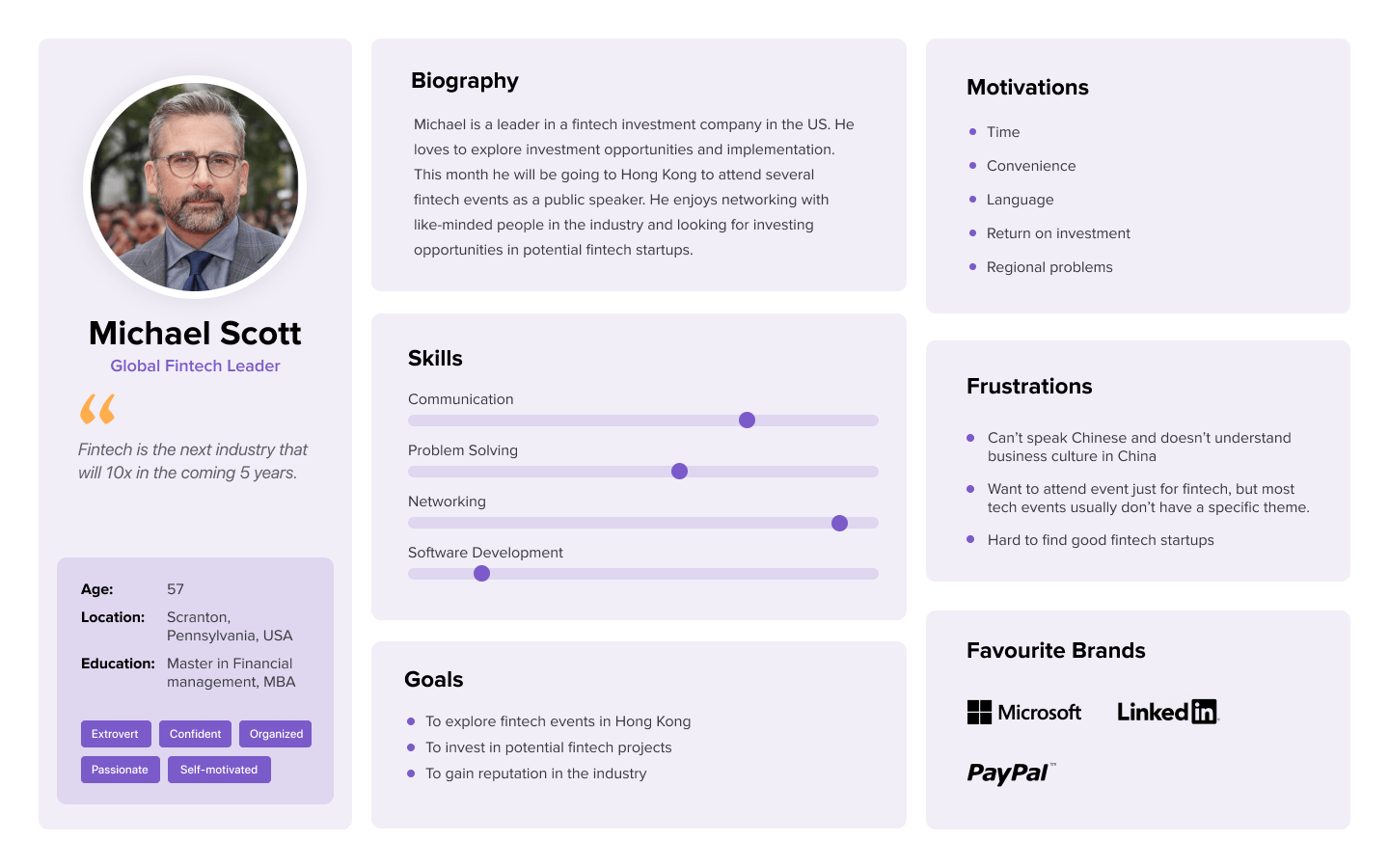
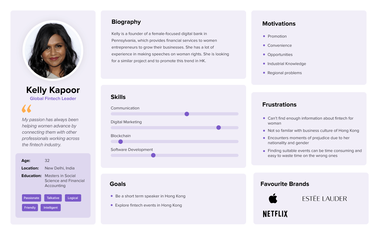
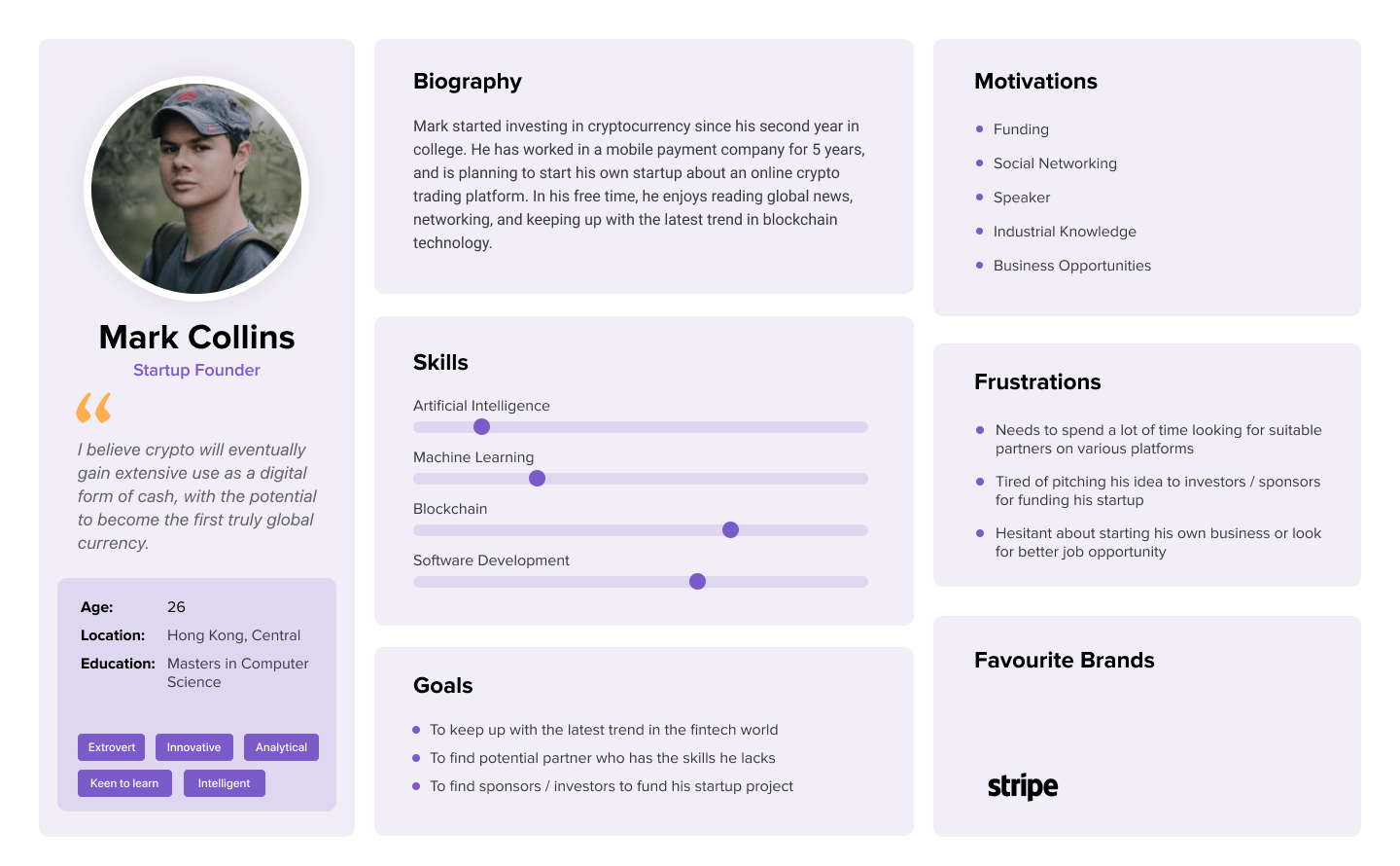
I found out which types of people are interested in visiting their website. I did three Personas, including Potential Participants, Investors, and Speakers.
Added missing pages
Their website previously lacked "About us" & "Contact us" pages. Through user interviews and analysis, these pages as essential for achieving their goals.
Mobile Interactive prototype (About us to contact us pages.)
About us page
Before & after
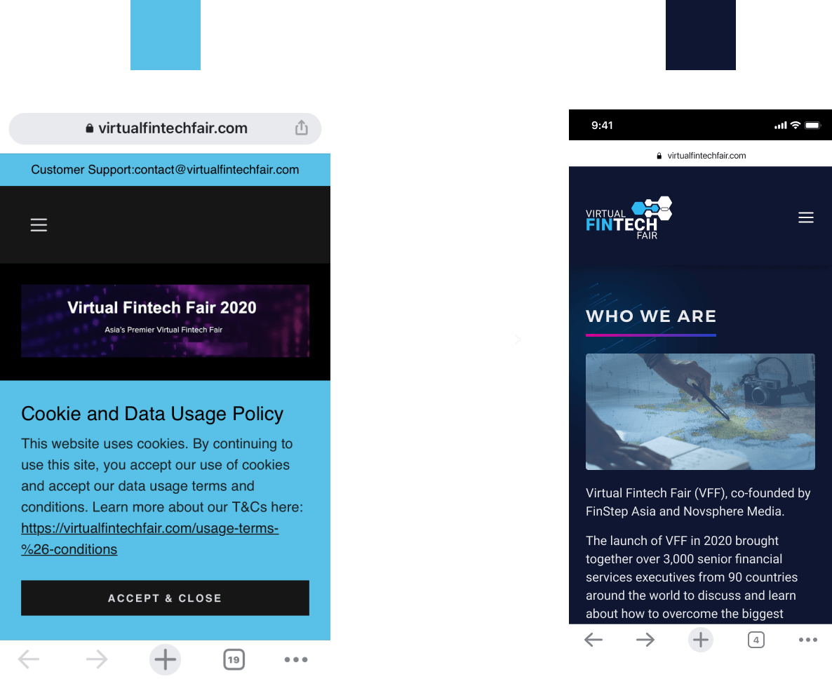
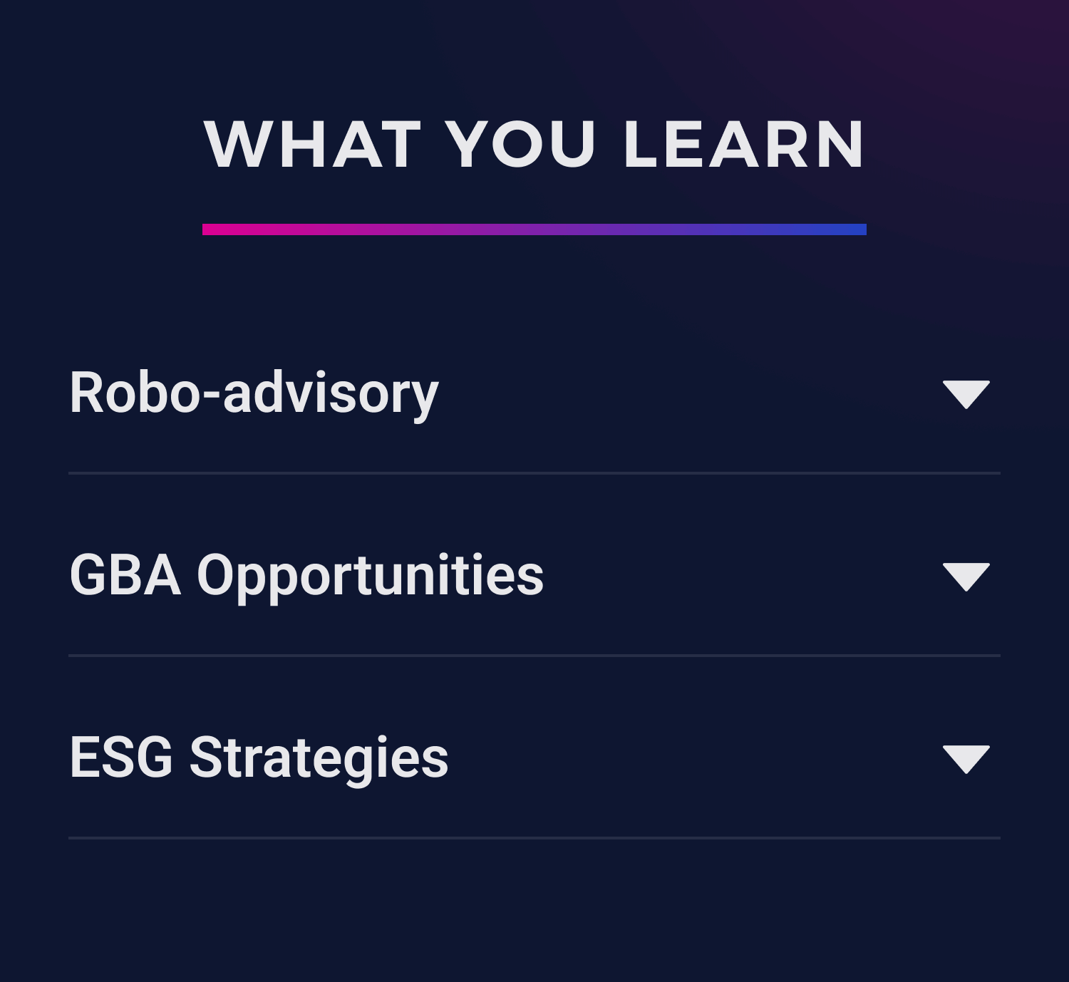
We tested the company's website background color and found it was too intense for users. We changed it to dark blue and used their brand colors for icons and patterns. Now, it's more comfortable.
after
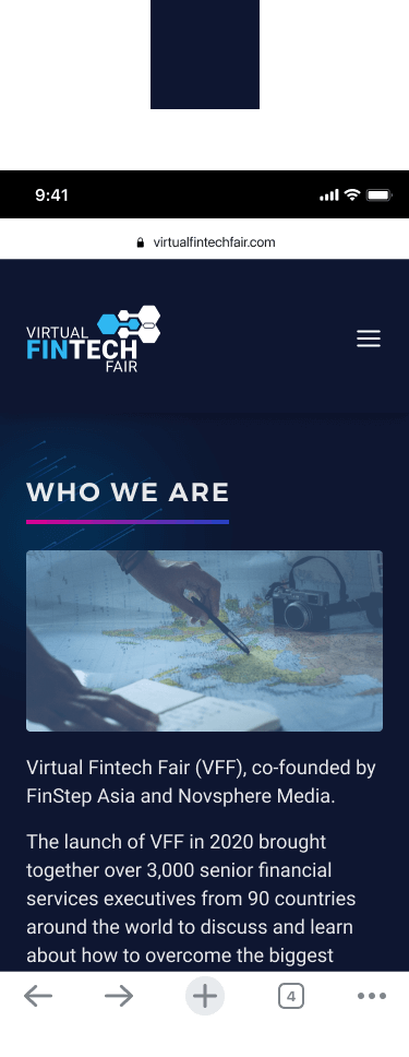
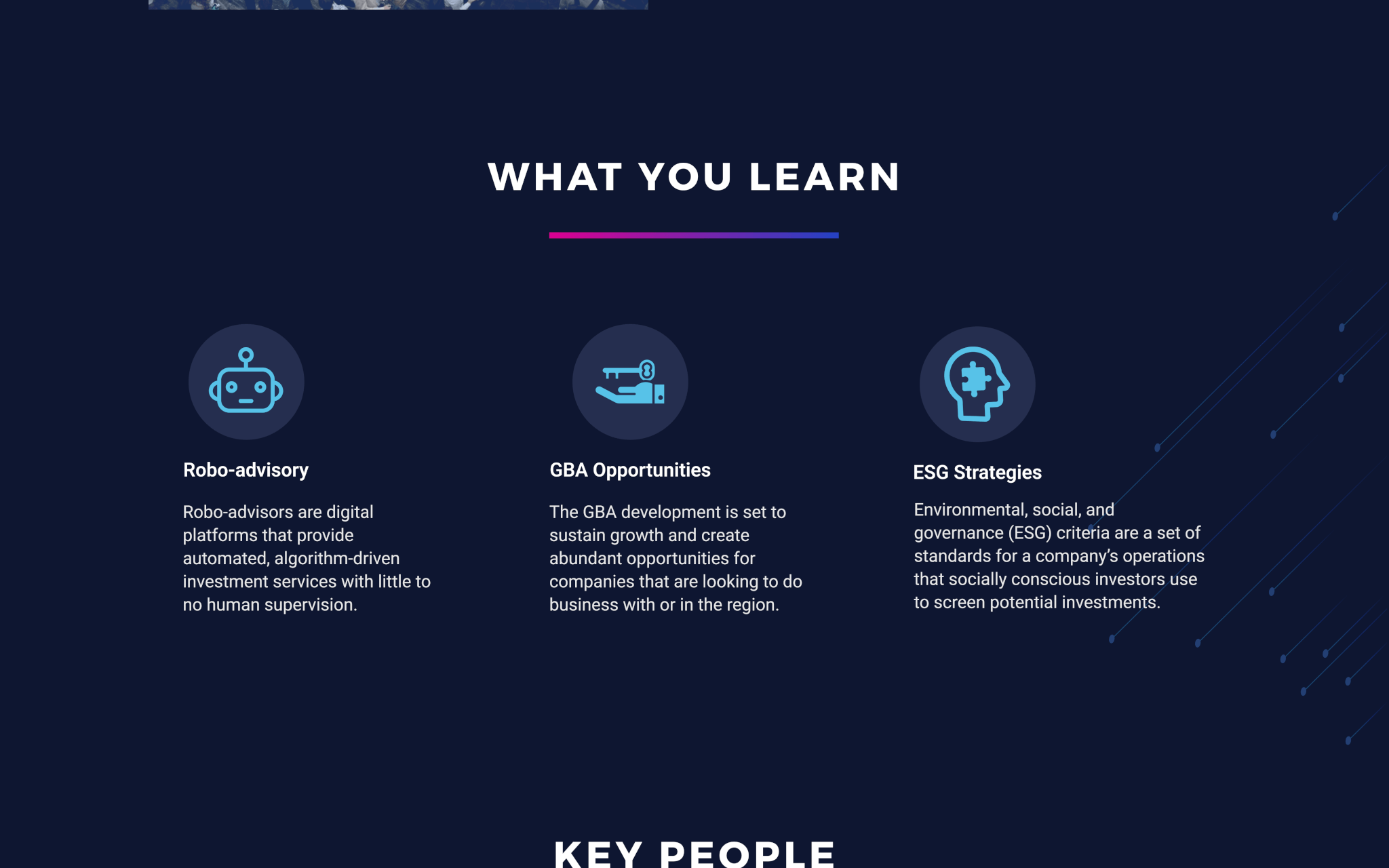
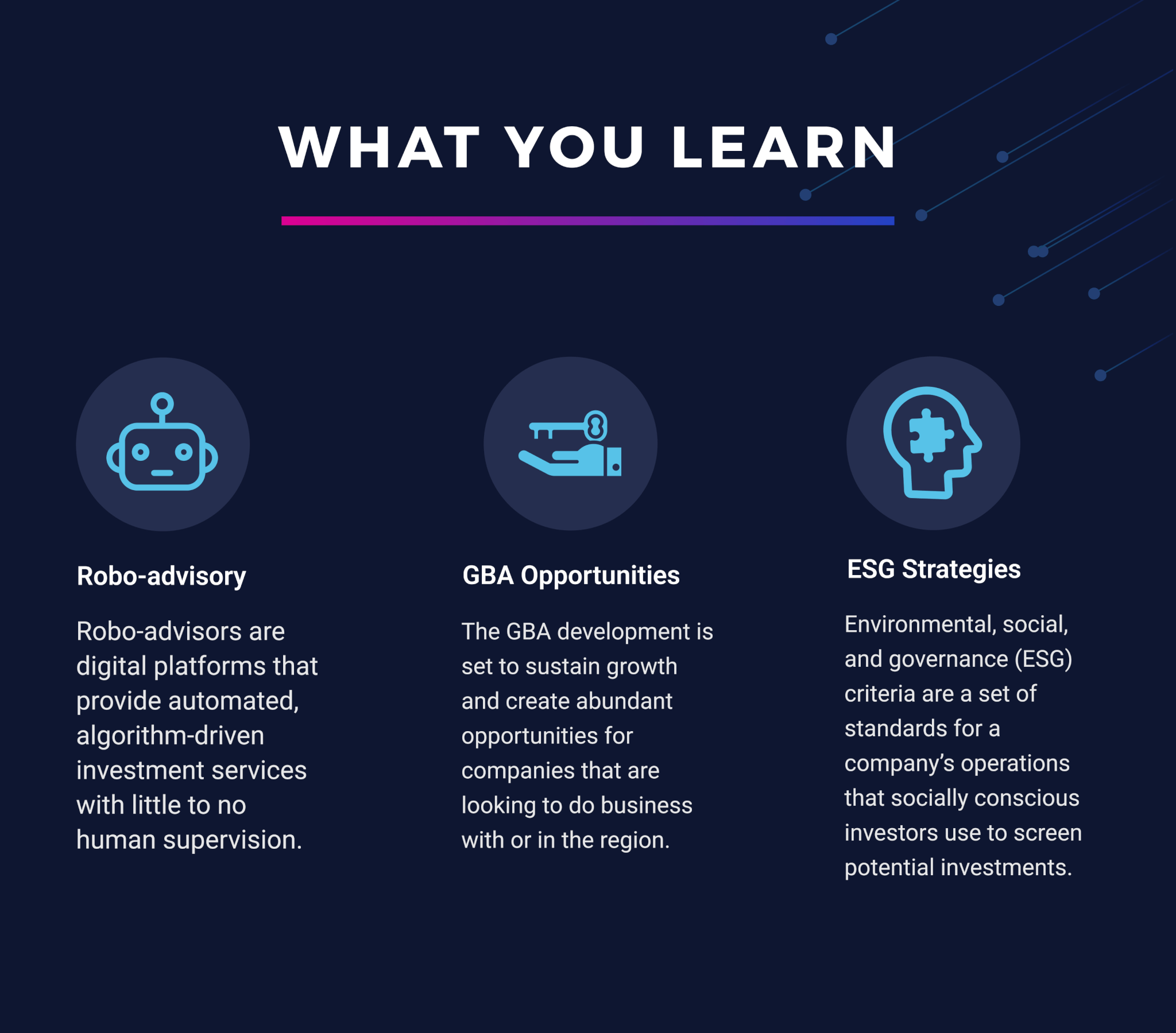
We incorporated design elements to make the website feel more techie by using their brand colors on the pages.
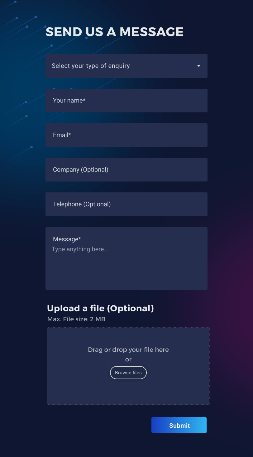
The mobile version removes unnecessary elements, making the webpage cleaner and more concise.
Contact us page
after
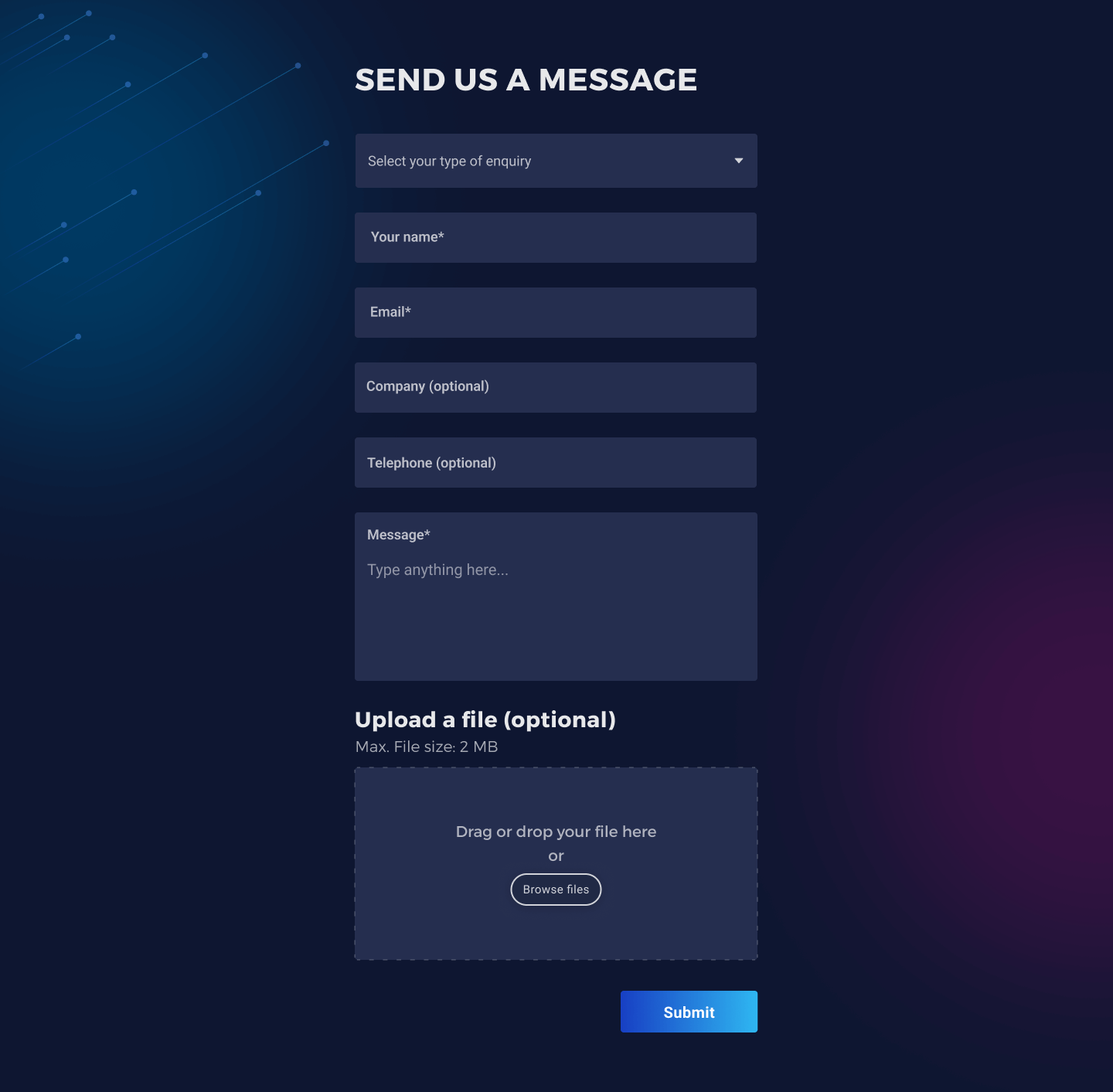
A selection button in the form input field to help reviewers easily process submissions.
A file upload button, allowing companies to easily upload documents about their business.
To sum up
In this project, I focused on understanding user needs by identifying pain points, creating personas, and mapping out user flows. These steps helped ensure a user-centered design before the team created wireframes.
As a team lead, I love discussing the reasons behind the design before they are finished. I make sure the designs are good for users and match project goals such as interaction and company brand UI.
I also implemented responsive design by creating three versions: desktop, tablet, and mobile. Each version was adjusted to meet the specific needs of users on different devices with varying screen sizes. This ensured an optimal user experience across all platforms.
Feedbacks ✍︎
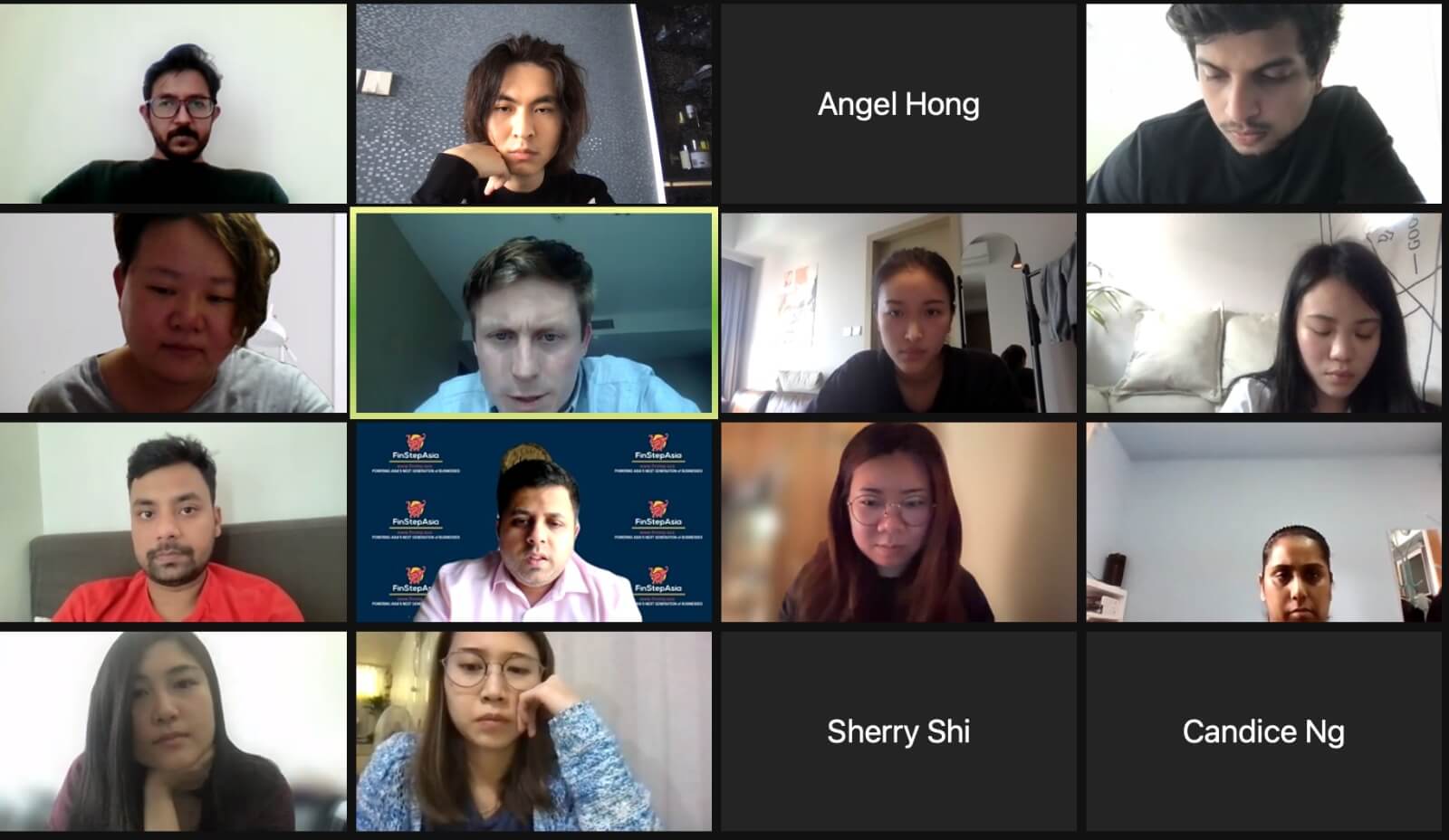
Both owners were satisfied with our decisions and the UI design after we presented it, and they were pleasantly surprised that we exceeded their expectations.
Reflection
In this project, I learned that success isn't just about the number of interviewees but rather the quality of questions and answers. Additionally, I mastered balancing client goals with design requirements.
✨😆 Thanks for sticking with my project till the end!
I'll keep refining it for a better experience. Don't miss out on the other exciting items waiting for you!
Get in touch🙌
Email: contect.terena@gmail.com
© Terena Tang 2024 UX/UI designer
Website built with Semplice
Hi, I'm the bottom line!
